When I’m doing a commission, I like to do a grid drawing to ensure accuracy of the subject. Using a grid is not the most fun way to draw, but it does help make a higher quality finished product for the client. Grid drawing is a time honored technique, and it’s a good skill for any artist to cultivate.
My client was kind enough to send a PLETHORA of reference images of her horse. Showing me multiple angles, especially of his markings. I use these photos as a guide to help me draw the subject as accurately as I can.

Ballpoint pen is one of my favorite sketching tools, for loose warmup sketches. (Never mind the mules, they’re just being good an doing their jobs) It’s always a good idea to get a couple shaky doodles out first.

Testing color, seeing what works. I’ve got a few go-to markers for this sort of stuff, but it’s a good idea to test run anyway. Over the ballpoint pen I added layers of alcohol based markers and water based markers (including fluorescent hi-lighters!) A white acrylic pen is great for light areas and high points

There’s a lot of muscle memory involved in drawing. The sketching phase is important because Doing some rough drafts helps to “train” the arm and hand before diving into a complex subject.
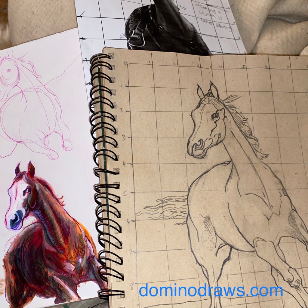
To prepare for the final draft, Start by drawing a 1×1 grid over the provided reference photo and then making an equivalent grid on toned paper. The grid allows me to measure as I draw for more accurate proportions. More care goes into this step rather than in the loose sketches, but I still keep those handy while I work.
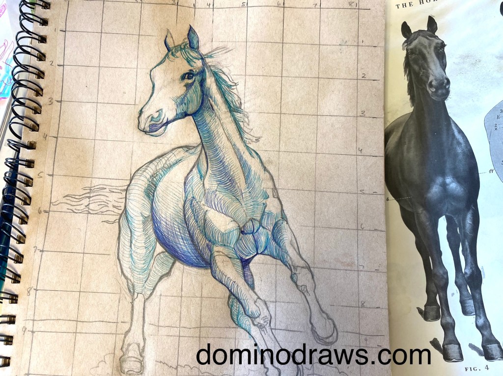
Why toned paper? Toned paper provides a mid-tone and helps to hide unsightly marker streaks. It also really pops the opaque ink layers later on.
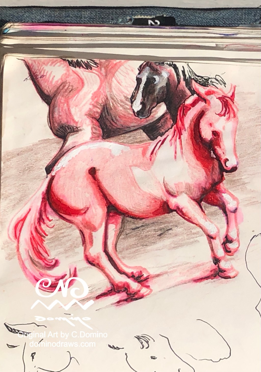
Muscle groups are shaded with ballpoint pen. I chose to use blue pens here to create contrast with the chestnut-brown coat of the horse. These lines help suggest the volume of the forms and add weight. Shout out to the Atlas of Animal Anatomy for Artists for helping me stay honest.

Adding alcohol marker layers. The alcohol based ink partially dissolves the ballpoint ink and softens the lines.

If I was smart, I’d have washed in the background first, but I’m not, so I didn’t but nbd I can still work around it 😉 it can be kind of a headache doing it backasswards like this, and you run the risk of the sky bleeding into the subject. But I couldn’t help myself, I just wanted to jump right into the fun part. It’s easier to cover such mistakes when you can draw over them, but it’s a lot harder to remove ink when it covers up what you’ve already done. Steady hands prevail here!
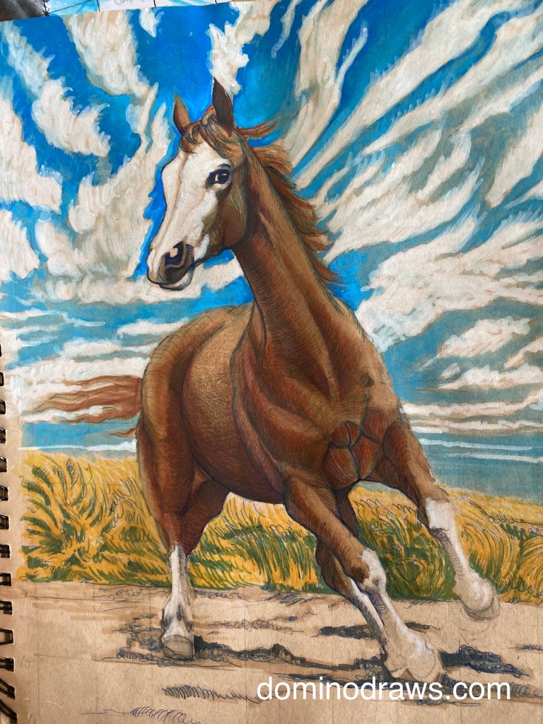
Almost done! I mixed a solution of blue acrylic ink and 91% isopropyl in a water brush to wash in the sky. White acrylic marker and paint markers help deepen the sky especially near the “top” where the sky naturally appears deeper blue, But the clouds need to be cultivated more. I blended out the first layer of white acrylic with more of my blue Ink solution and then added more “fluff” with white acrylic and defined the shapes with more paint markers.
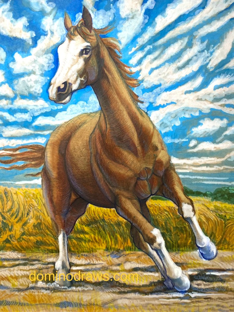
And done! More white acrylic to beef up the light areas, Finished the legs and foreground and added the final layer of colored pencil on top. Reflected Blue light on the shadow side, pale yellow on the sun side.
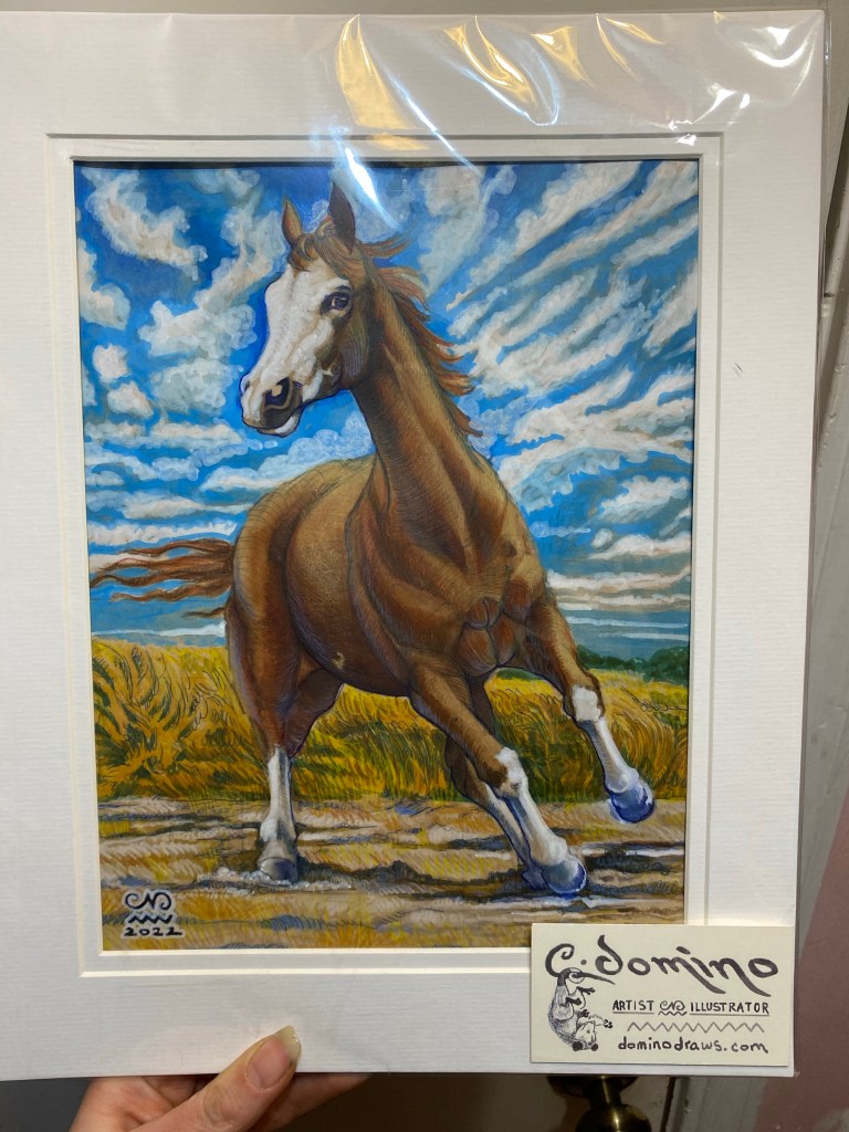
And here’s the final product, matted wrapped and ready for delivery. Thanks so much for sponsoring my creative endeavors! I had a lot of fun working on this. If you’d be interested In having a piece like this made for yourself, or as a gift for someone you know, check out my Contact Page for commission info !